Warning: Undefined array key "file" in /srv/users/evolve/apps/evolve/public/blog/wp-includes/media.php on line 1788
Warning: Undefined array key "file" in /srv/users/evolve/apps/evolve/public/blog/wp-includes/media.php on line 1788

If you've been wondering how to organize your oil painting palette setup then you're in the right place!
In school we're taught that there are three primary colors, but that's not actually the case. Anyone who's taken paint and mixed red and blue knows they don't get purple, they get brown. In order for a palette to work you have to have both a warm and the cool of each color.
The Order Of Colors On Your Palette
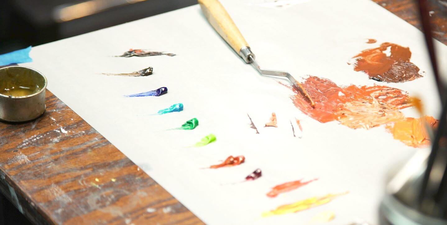
The way we set up our palette is white, then Naples Yellow (cool then warm). Next we have two yellows (generally we have a lemon yellow, something really, really rich. After that we have two reds, a magenta or crimson, two greens, blue blues, burnt umber, and then a black. You can see how we set up our oil paint palette below:

#1 - White
#2 - Naples Yellow
#3 - Schev Yellow
#4 - Schev Red
#5 - Terracotta or English Red
#6 - Magenta or Crimson
#7 - Cadmium Green Light
#8 - Phthalo Green
#9 - Cerulean Blue
#10 - Phthalo Blue
#11 - Burnt Umber
#12 - Mars Black or Ivory Black
Why You Need Two of Each Color
If you mix a cool red with a cool blue you get violet purple, if you mix a warm red with a with a blue you wind up with brown. The way that we're taught in school doesn't actually work for painting. You have to think in terms of six primary colors: two yellows, two reds, and two blues (one warm and one cool of each). In addition to that, I would recommend white and Naples yellow. Both white and Naples Yellow are both lightening agents; when you mix them into that into paint they will make the paint lighter. They will strip away some of the color too (the white is cool and the Naples Yellow is warm). If you take a neutral red and you mix white into it what you get is a pink and if you mix Naples Yellow into it you get an orange (a delicate orange, but an orange). And then on the far end of the spectrum, I like to have black (a cool black and Burnt Umber which is a which is warm). So as you can see, its quite necessary to have two of each color on your oil painting palette setup.
Click to enlarge the Old Holland oil paint color chart.
A Very Colorful Palette is Best

In your oil painting palette setup, your choice of colors pigments should be very... colorful. We don't want colors that are more neutral because if we need something that's a high color key (something really rich and colorful) you can't create a rich dynamic red from a dull red. You need to start rich and if you want to downgrade, neutralizing it, you mix other things into it and take the edge off.
Final Thoughts on Organizing your Oil Painting Palette Setup
A well organized and colorful palette will help you create beautiful paintings. Remember to set your palette up with a warm and cool version of each color. If you need help choosing colors check out the color chart on the Old Holland website and read this article that covers which painting supplies are best for beginner artists.
A shoutout to our partners at Old Holland: At Evolve Artist, students are given the opportunity to exclusively use Old Holland Paints to complete their exercises. Old Holland is the oldest paint manufacturer in the world and is the highest quality of paint and the best oil paint on the market as the color are of the highest pigment and the materials were made using the highest quality of ingredients and processes. Evolve couldn't be happier with Old Holland!
FREE MASTERCLASS:
The 4 Part Framework to Develop Artistic Excellence in 12 Months

