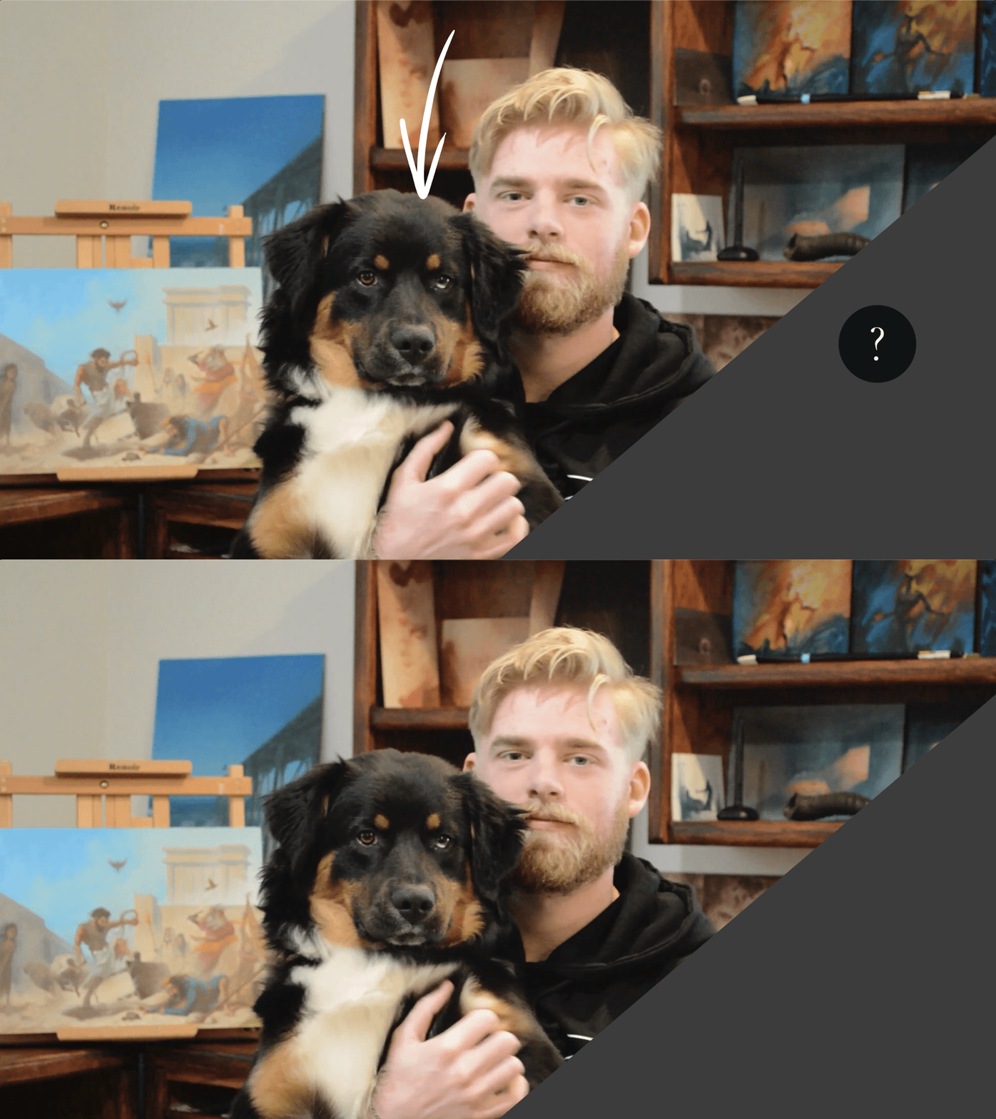
Daniel Folta of Evolve Artist with his dog Carter.
Do you know how to simplify color for painting? Look at the above photo of Carter the dog. What color is this part of Carter’s fur? Is it black? If so, then what color is this:
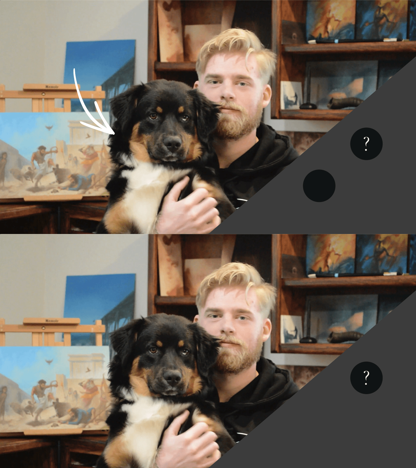
Two sections of Carter's "black" fur reveal how our brains can play tricks on us when we're seeing color.
This part is definitely black. But if that’s black, then the first color must be...

Knowing how to simplify color can help you determine the difference between the blacks of Carter's fur.
Gray-ish yellow? Learning how to simplify color is the fourth fundamental of art at Evolve Artist.
How to simplify color is the fourth fundamental of art at Evolve Artist.
Learning how to simplify color builds upon the first three fundamentals of art. If you haven’t read about them yet, you can check out the previous posts on value, edges, and perception first and then continue here.
How We See Color
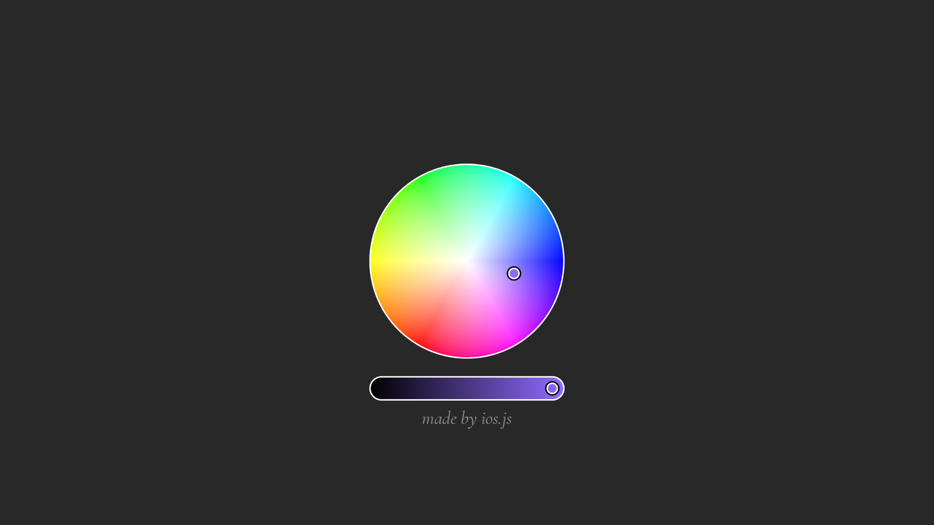
Color adds dimension to value where one value could represent many different colors.
Color adds an additional dimension to value. Value goes from dark to light, but color is less linear. You could have five, ten, twenty, thirty, who knows how many colors, that are all the same value.
*Most people view color based on whatever the object is made out of, such as its mechanical makeup or whatever pigment was used.
For example, we look at my sweatshirt and we see that it's black and our brain simplifies it so that it can move on and process more important things. However, if we’re trying to create a representational piece of art, then calling the sweater “black” is an oversimplification of the reality and the beauty of what's really going on.
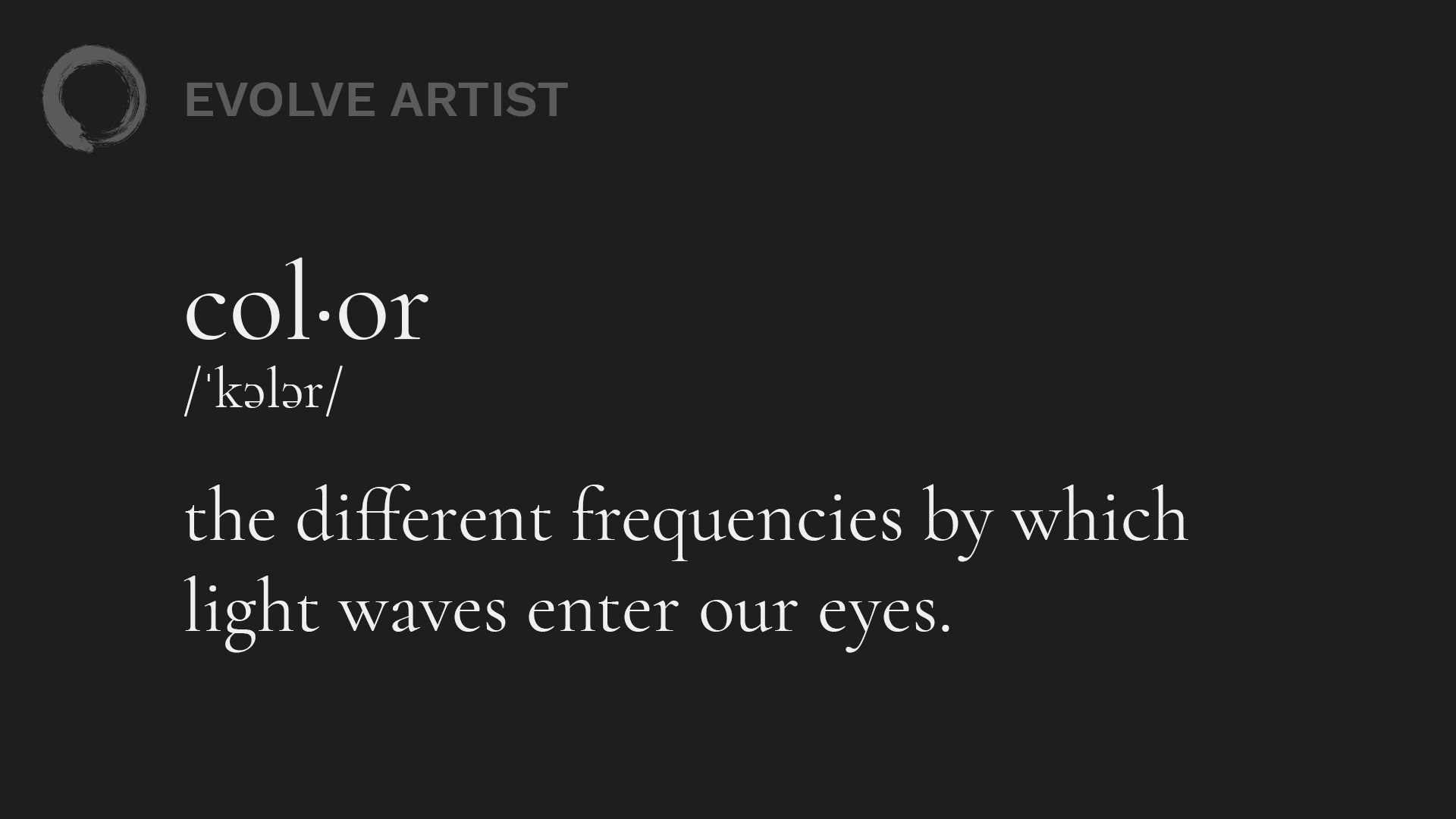
The definition of color is the starting point to understanding how to see colors as they truly are.
We see color through light waves that are bouncing around and interacting with our environment before entering our eyes. That's why, when we look at my black sweatshirt, we can see it and we think it's black. Even when I change the light and the colors are changing, we still think that it's black.
Our brains do all this processing for us. However, if we wanted to recreate this in reality, we would have to be very specific about what colors we’re using to capture this impression of a black sweatshirt that belongs in this environment. In order to do that, we need to see these colors as they truly are, not simply based on what they're made out of.
Seeing Through the Illusions to Recreate Them
If we could see these colors, as they truly are, then through time, effort, and gleaned experience, we should be able to match the colors and recreate them on a canvas. The tricky part, though, is seeing the colors as they truly are.

The strawberries in this photo by Akiyoshi Kitaoka look "red" but are, in reality, a neutral gray.
Our brain plays tricks on us. For example, we see these strawberries and we think that they're red, when in reality they're a neutral gray. So if you were to recreate this illusion, you would have to paint those strawberries in gray to make them look red. (Check out THIS video explaining why we see those strawberries as red).
In short, if we understand how to see and train our eyes to be able to see these colors as they truly are, we can see through the illusion so that we can then recreate it ourselves on a two-dimensional surface.

Understanding the properties of light will help us to see color better.
Because color is based on the light, there are properties about light that we can understand that will then help us to see color better. Remember, color is found in the light because color is simply the different frequencies at which those light waves enter our eyes.
Color in the Light
On the flip side, shadow is simply the absence of light. This also means that where there's more light, there’s more color.

The colors in the shadow are relatively gray compared to the colors in the light.
So as a general guideline, shadows are relatively gray compared to lights. This is a good starting place for structuring how we approach color, but there's more.
Color Temperature
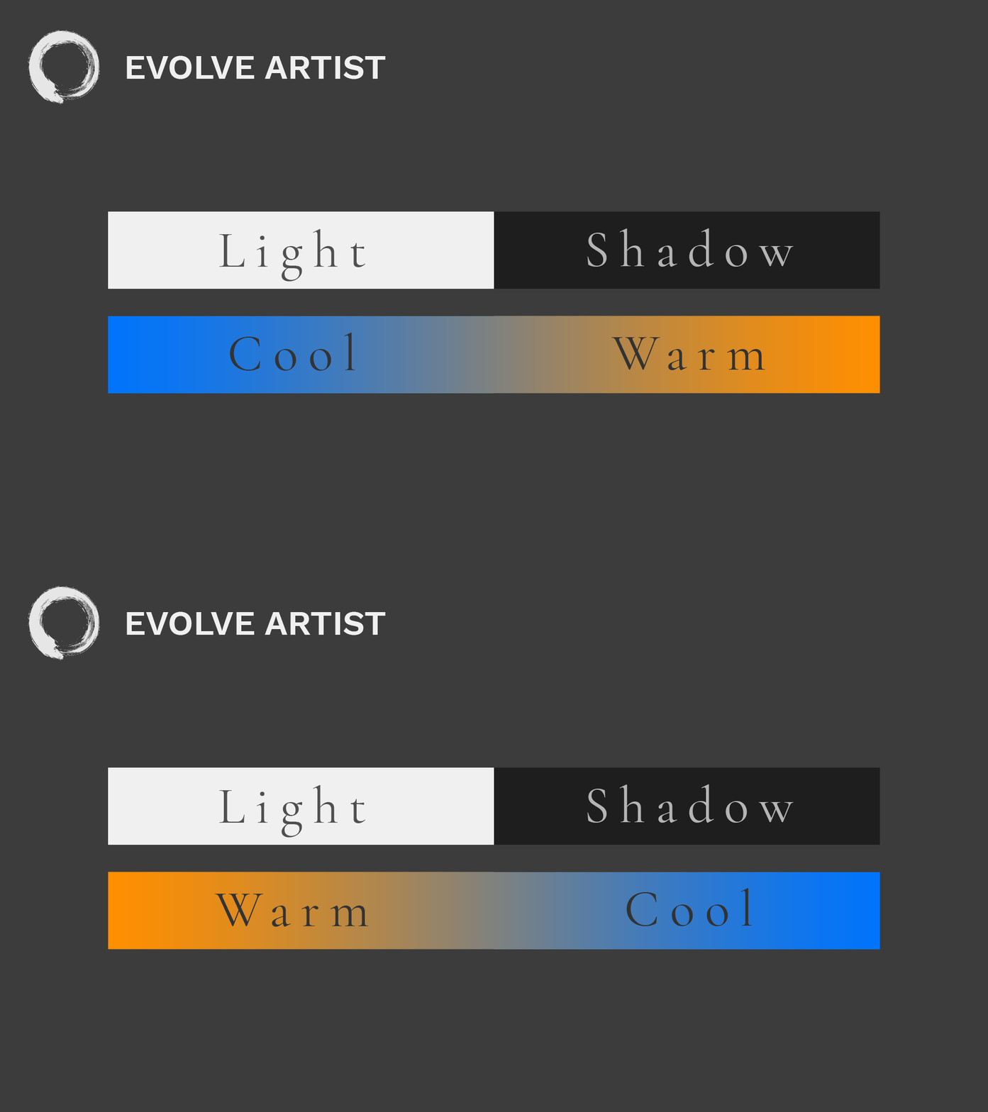
Determining whether the light is warmer or cooler than the shadow is key to understanding how to simplify color.
Enter color temperature. Because everything is relative to each other, the light will be either warmer or cooler than the shadows.

A warm light will alter the color in an image.
If you shine a candle or a tungsten bulb on these objects, the light will be distinctly warmer than the shadows.
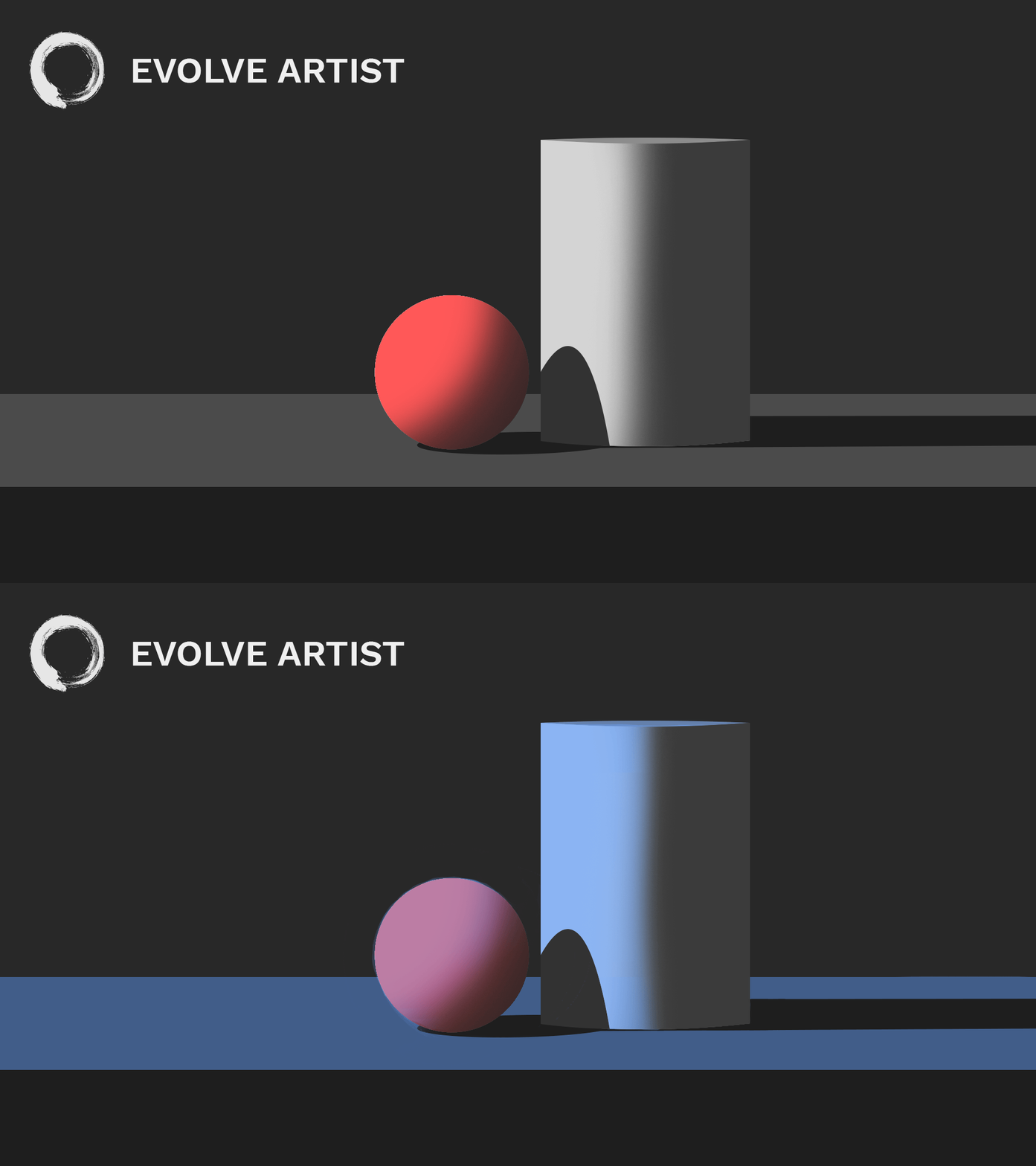
A cooler light is cast on the image of a ball and can.
In other settings, the light can be cooler than the shadows.
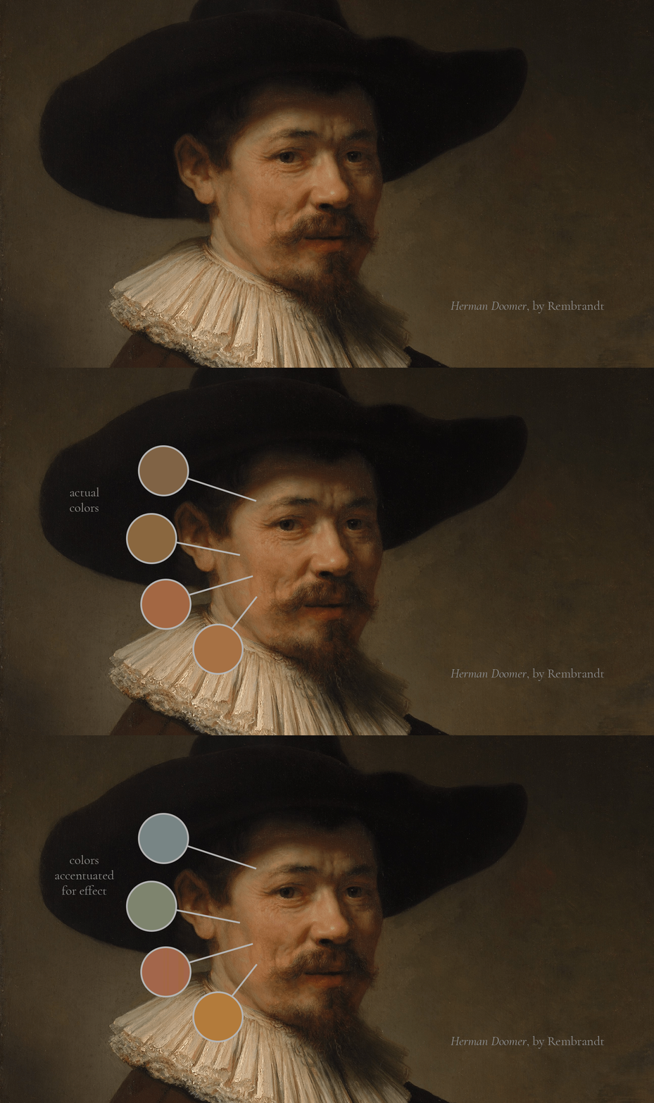
Subtle shifts in color temperature are more noticeable when accentuated in this example from Rembrandt's painting, Herman Doomer.
There are also subtle temperature shifts that can happen in the slightest turns and form. This is a common topic of discussion when it comes to portraiture.
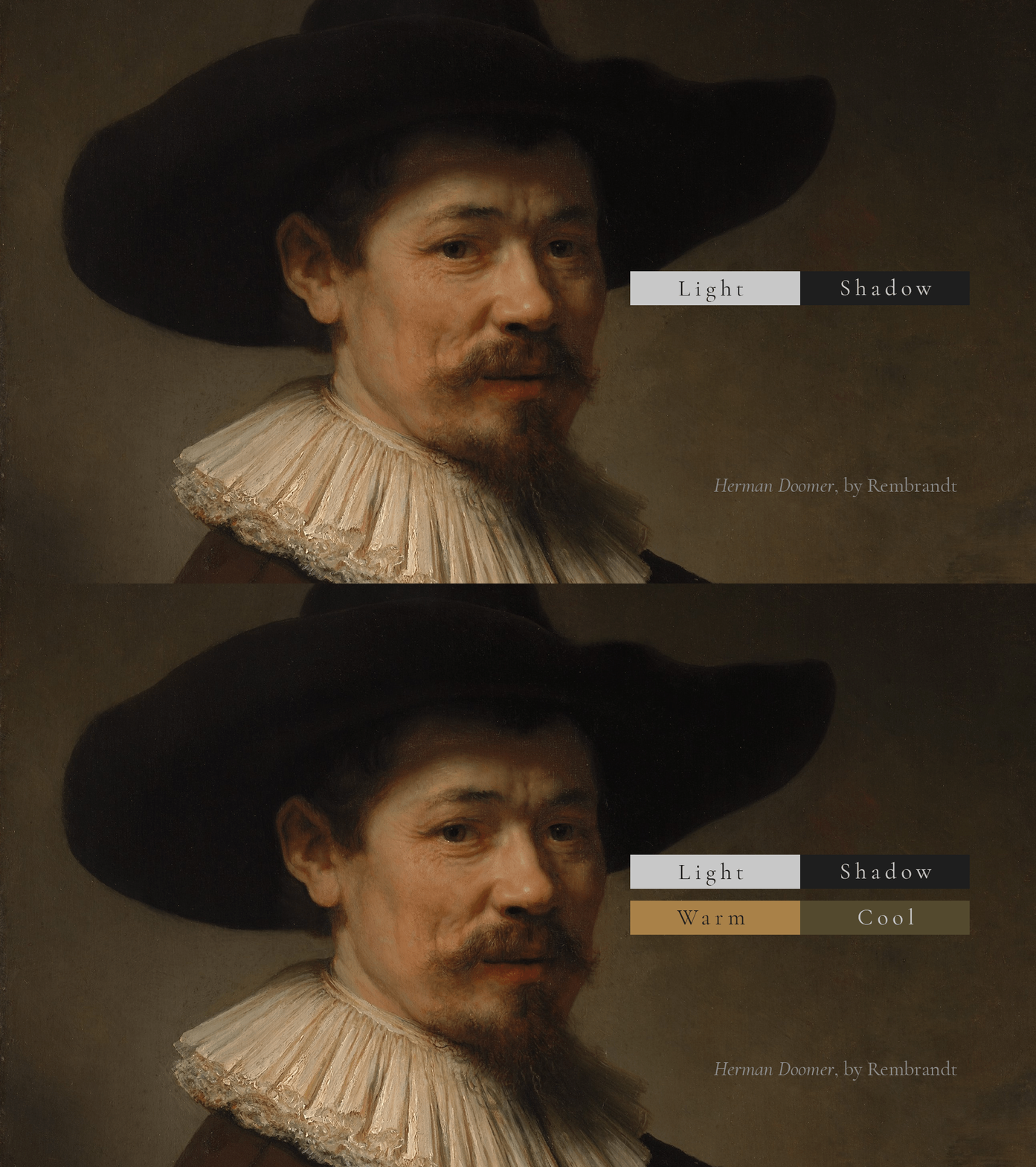
Determining the overall color temperature is an important step in learning how to simplify color.
First, though, you’ll want to determine the overarching light and shadow and figure out what the warm and cool relationship is before proceeding from there in order to keep it consistent across whatever artwork you're creating.
Mixing Colors
Now that we’ve covered seeing color, what about mixing color? How do we get on the palette and match these colors that we're seeing?
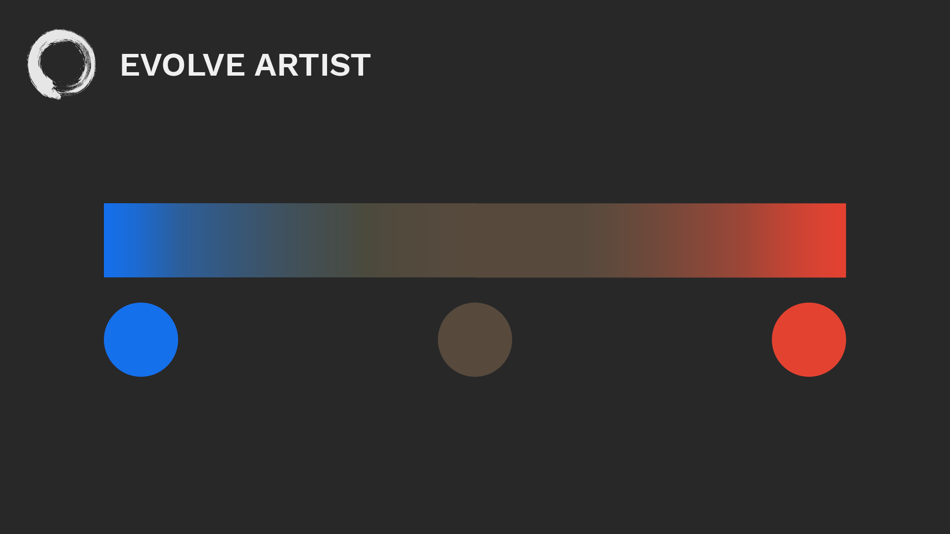
Mixing warm blue and warm red make brown, demonstrating how three primary colors aren't enough to start with.
To mix a full spectrum of colors on your palette, three primary colors aren’t enough. For example, mixing a warm red and a warm blue is not going to make purple; it's going to make brown.

At Evolve Artist, our palette has a warm and a cool version of each of the primary colors.
We actually need six colors, a warm and a cool version of each. This is going to give us the majority of the colors that we need in order to recreate the colors that are around us.
As you're practicing your color matching, it’s important to keep comparing the mixture you're making to the reference of the color that you're trying to match so that you can find its true color.
How to Simply Color for Painting to Capture Form
Now, how do we use color to capture form? Again, it’s with light and shadow.
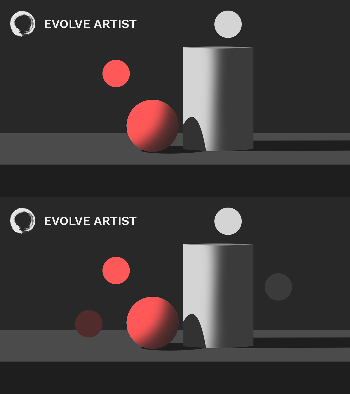
Colors in the light are more colorful than those in the shadows, which are relatively more gray.
Light traveling from one direction can't reach the other side of an object which creates the illusion of three dimensions. When we keep our shadows relatively gray compared to our lights, the lights will be more colorful.
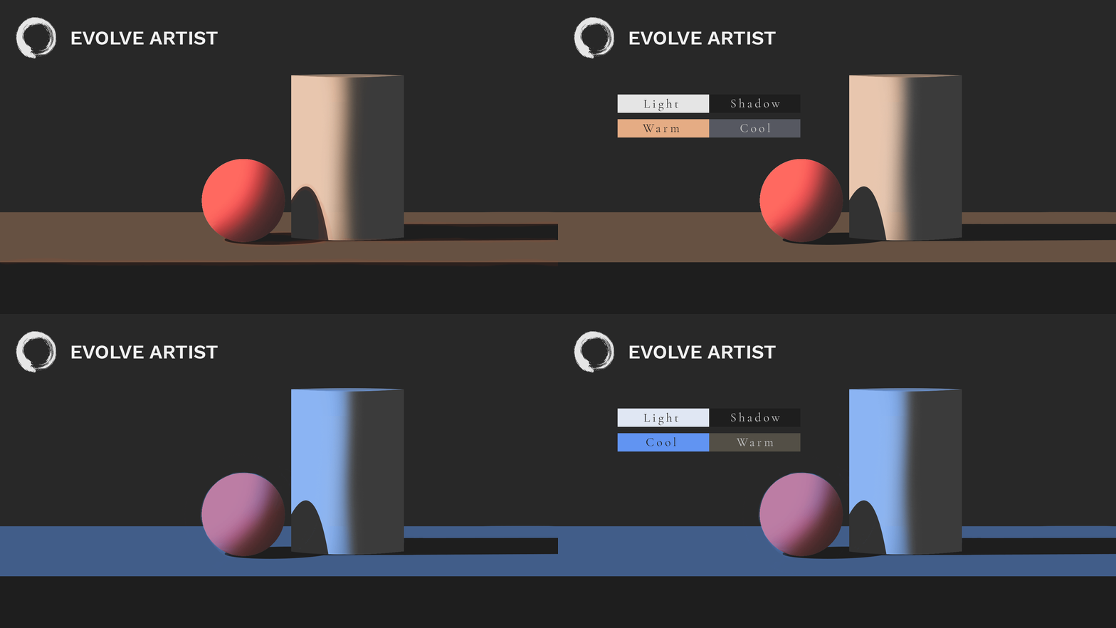
A balanced relationship between color temperature and light and shadow creates the illusion of three dimensions.
When we watch our temperature relationship between light and shadow, we reinforce the illusion of light and shadow on the two-dimensional surface that we’re working on to create the impression of three dimensions.
How to Simplify Color for Painting to Create Depth
We can also use color to create depth. In our first post in the Fundamentals of Art series on values we saw how when values drop off as they recede into the distance, they become more like the background, more muted.
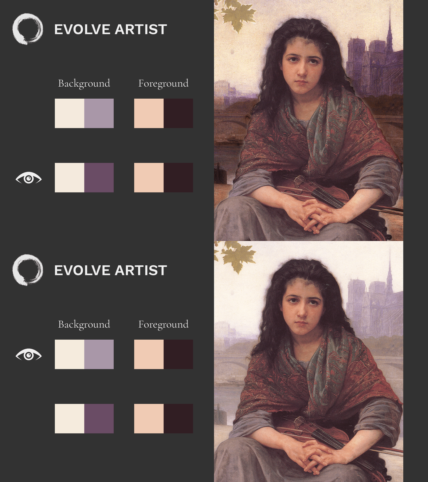
Colors, like values, become more like the background the further they recede into the distance in an image.
The same thing applies to color. So, the further away an object is, the closer in color it will become to the color of the background or the environment that it's in.
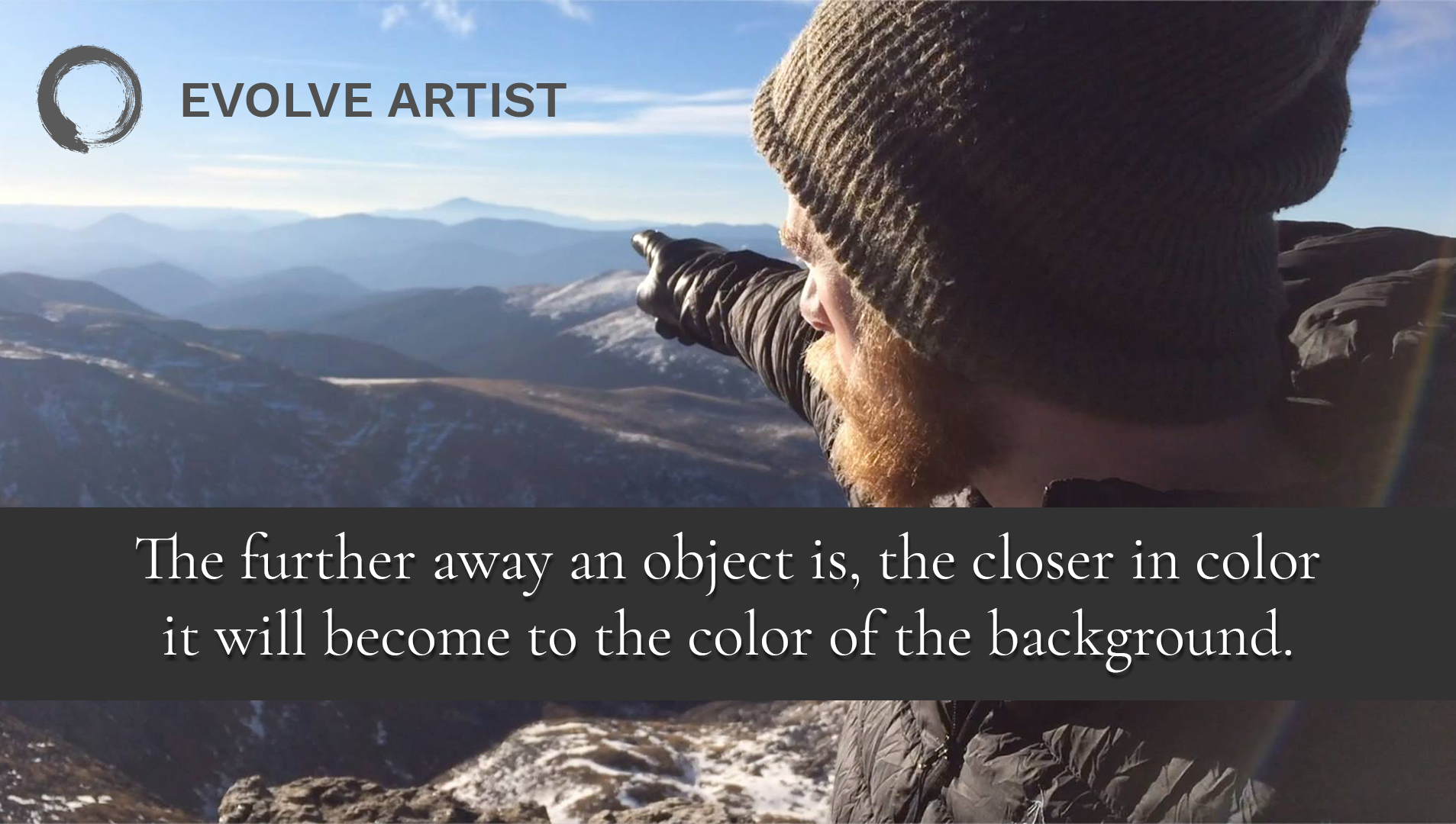
As the mountains recede into the background, they become more blue like the sky.
For example, if we have a blue sky, these mountains become more and more blue as they recede into the distance. Gradually the mountains lose variations in local color like the red bark on the trees and the green leaves. We’re not going to see those colors anymore as they fade away into blue.
Simply put, low contrast in color pushes back and high contrast in color pulls forward.
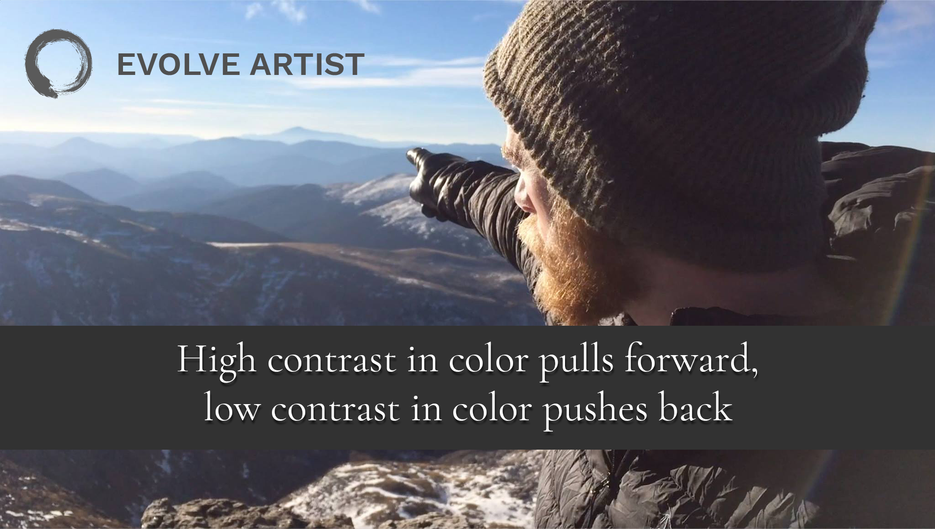
The images in the foreground with high contrast pull forward visually; the mountains with low contrast in the background push backwards.
Seeing Complexities of Color Starts With Simplicity
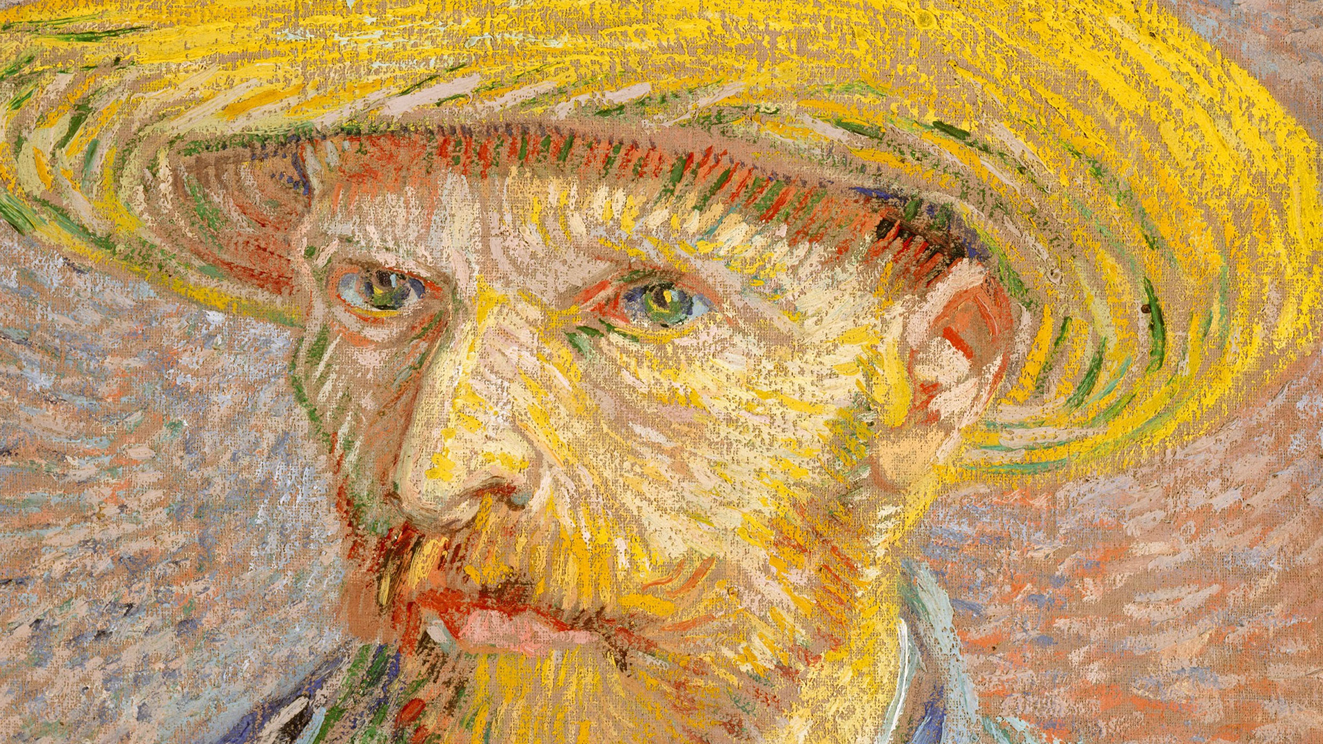
Van Gogh painted his masterful Self Portrait With Straw Hat with the understanding of the relationships of colors and light and shadow.
This is only scratching the surface of the iceberg that is color. It's so complex and beautiful.
Once you start seeing these colors for what they actually are, you'll never be the same. You won't be able to unsee the beautiful relationships of colors that are happening all around you at all times. You can get there by applying the knowledge and training and by practicing and growing in experience.
We could go on and on, but at Evolve we want to keep things concise and simple. We teach our students to digest one piece of information at a time and start applying it. They then convert it into experience and skill, knowing that these fundamentals are the most influential tools that they can use to recreate this world around us.
Conclusion
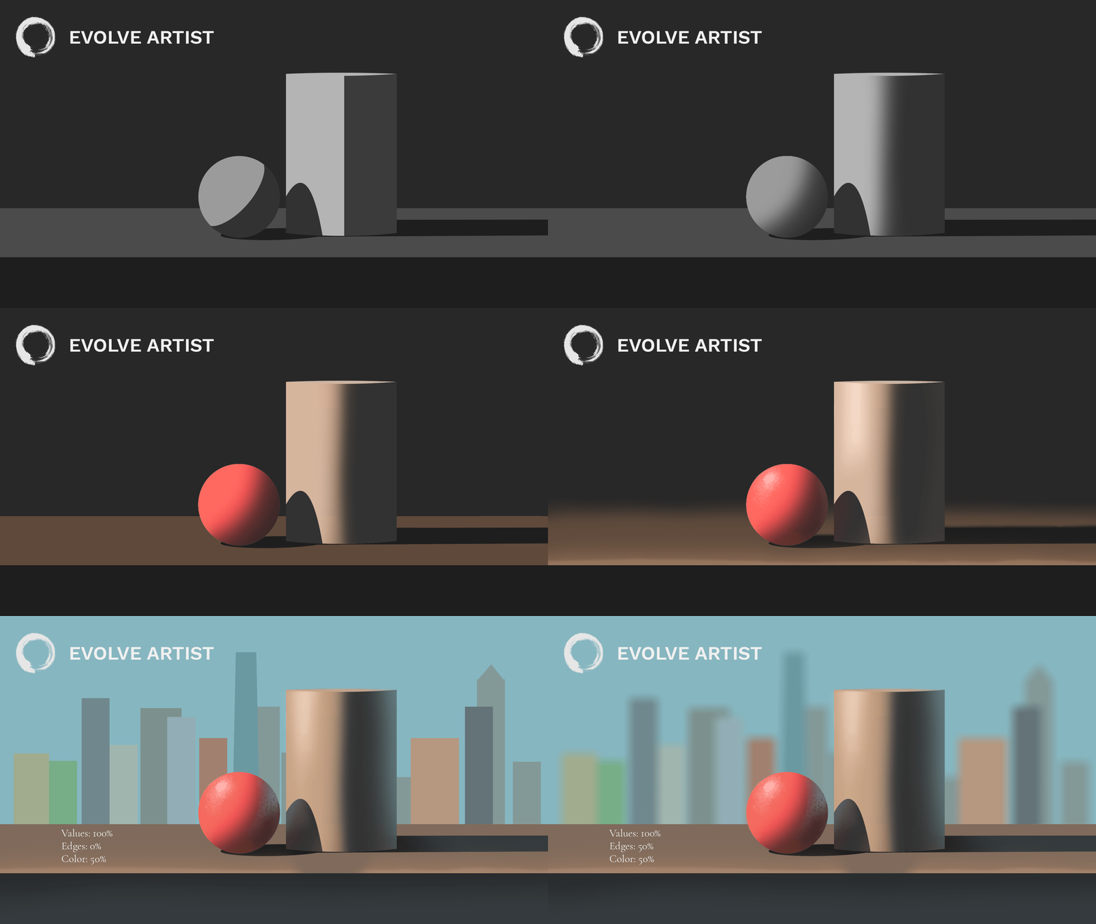
With the knowledge of the four fundamentals of art, you can combine them to make your paintings come to life.
These are the four fundamentals taught in the Evolve Artist method. The final post will continue the series by talking about how we can combine these four fundamentals together.
Stay tuned by subscribing to our newsletter or check us out on YouTube and follow us on Instagram. And if you are serious about wanting pro-level art skills, then check out Evolve Artist. We have a program that is designed for you. Our program can give you the knowledge, guided experience, and the focus you need to get to artistic excellence. Join Evolve today!
Happy painting!
This post is Part 4 of our Fundamentals of Art series. Click HERE to read about values, HERE to read about edges, and HERE to read about perception.
