Capturing the beauty of a sunset in a painting isn't easy. A red/orange sunset with black silhouettes would get the idea across, but it wouldn’t capture the warm glow of the sun in a real sunset.
If you're wanting to know how to make the sun glow in paintings, then this post is for you.
Evolve Artist and resident YouTuber, Daniel Folta was faced with this exact challenge when he was commissioned by a close friend to paint a beautiful landscape with intertwining trees overlooking the ocean, but with one big change. Folta was asked to turn the daytime scene into a sunset scene, changing the lighting situation completely.
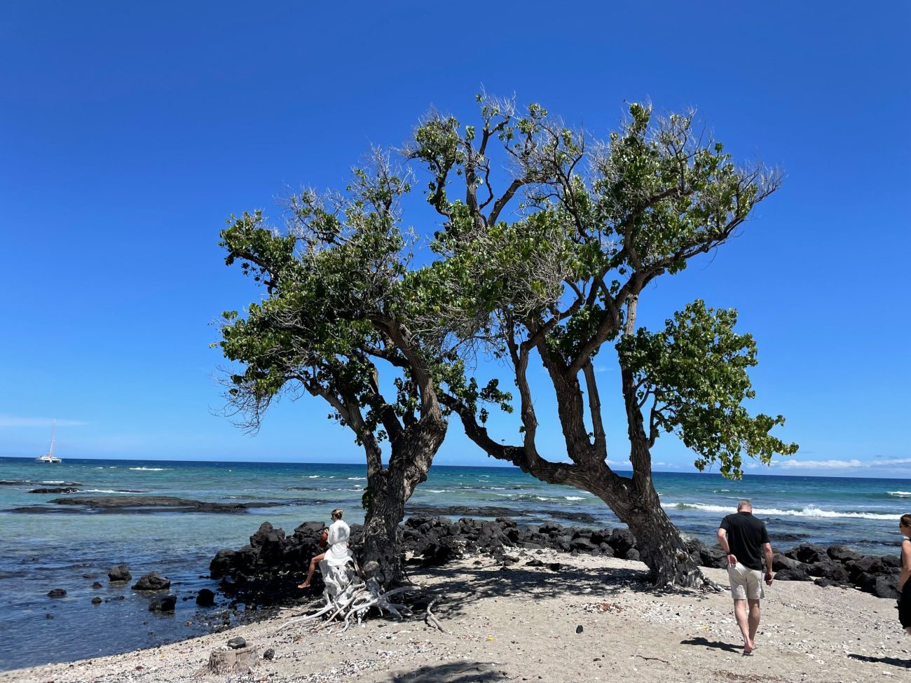
Changing this daytime scene to a sunset would dramatically change the painting's mood and lighting.
Daniel wanted the painting to capture the feeling of a real sunset. There's a glow that feels like an embrace that black trees and a red sky can’t capture.

This is the image that inspired Daniel. The glow of a sunset isn’t only behind the couple, it's both behind and in front.
In today’s post, Daniel is taking us through how he used values, edges, and color (the fundamentals of art) to paint light and create a glowing sunset. This post is full of tips and techniques you can use in your own art.
To follow Daniel’s process pass by pass and hear the story behind this heartfelt commission, watch the full video on YouTube HERE.
And if you’re reading this and aren’t sure what values, edges, and color are, we’ve explained why they are so fundamental on YouTube CLICK HERE. If you prefer to read, CLICK HERE.
Let's hand things over to Daniel!
How to make the sun glow in paintings? Paint the light and shadow.
Hi! It's Daniel here. Before we get into the painting, I need to share with you a way of approaching art that informs how I paint any piece, especially the one I’m sharing today.
If someone asked you to paint a tree, what would you start with? A tree trunk, some roots, a bunch of leaves?
Artists in the Renaissance hit a major breakthrough when they began to use light and shadow.
The light falls on everything. Trees, people, clothes. Everything that we see is just light entering our eyes, and by it, we distinguish one object from another.
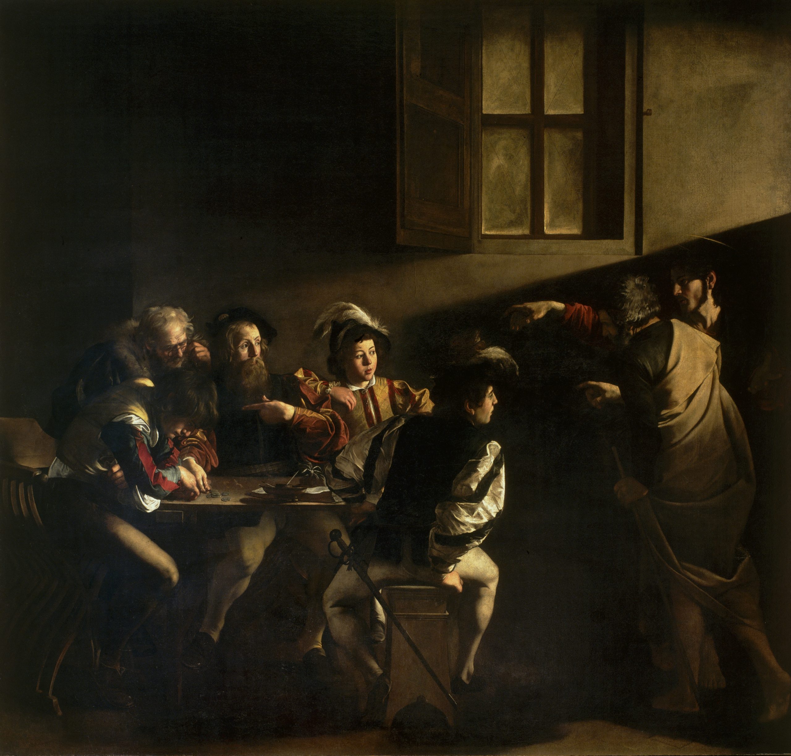
Caravaggio was a master of light and shadow (The Calling of St Matthew, 1599-1600).
So if someone asked a Renaissance artist to paint a tree, they would paint the light and shadow to create the impression of a tree.
It’s a different way of thinking but the implications are huge. If I’m good at painting trees, I might be awful at painting people. If I’m good at painting light, I can paint anything.
Tip 1
To create a glowing sunset, first remember that you will be painting the light and shadow caused by the sun, not the objects in your painting.
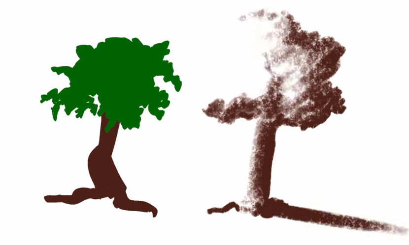
A simple example showing the difference between painting a tree, and painting light and shadow to create the impression of a tree.
To paint light and shadow, you need an understanding of the fundamentals of value, edge, and color. CLICK HERE to learn more about these fundamentals and their relationship with the light.
The first pass - creating the sunset.
Given the central importance of light and shadow for how to make the sun glow in paintings, I focused the painting on the light of the sunset.
After I did a transfer sketch, I toned the canvas in a burnt orange color because I decided to paint the glow of the sun first. I painted a circular gradient to the outer edges of the trees.
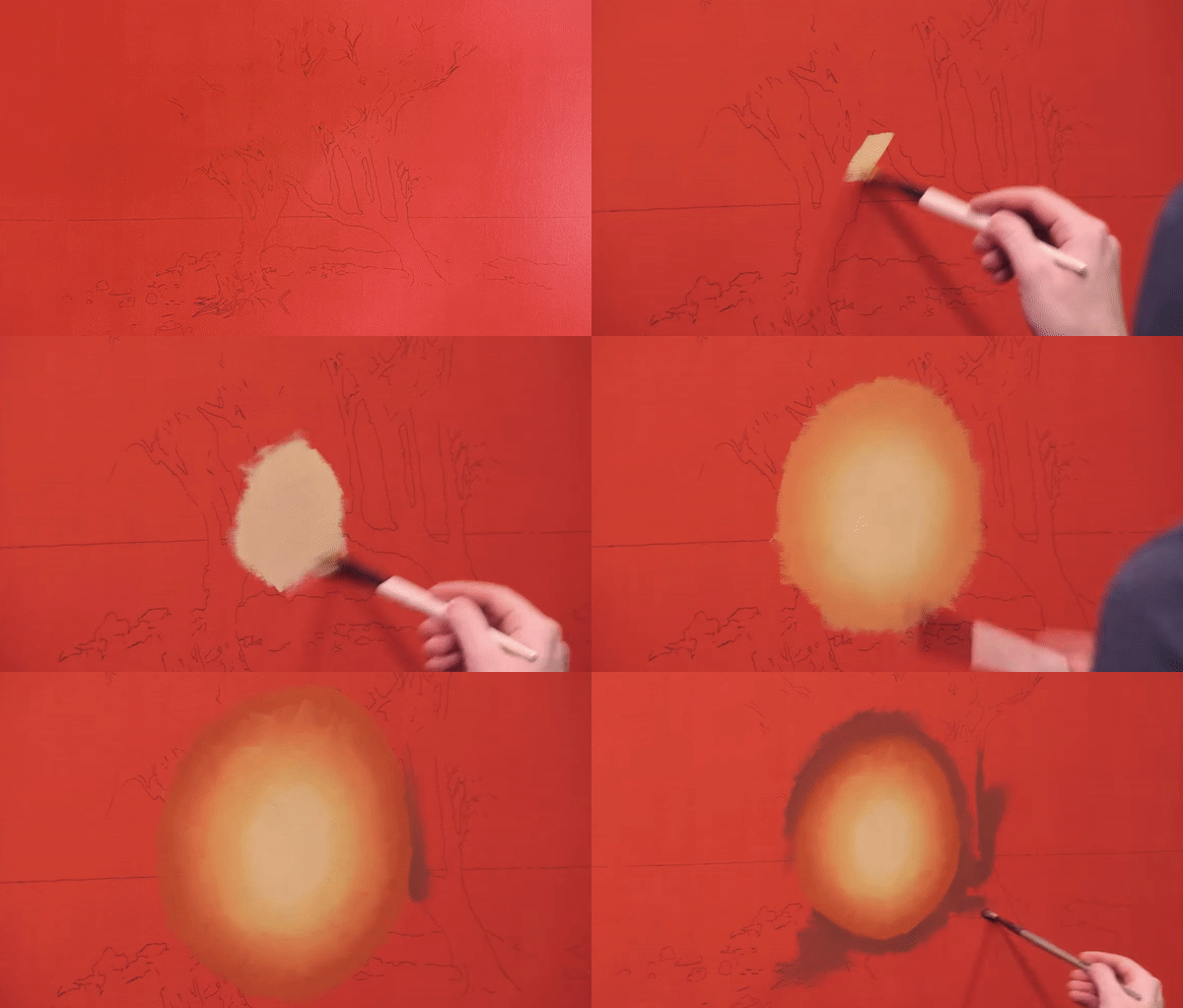
Painting the sunset first kept the focus of the painting on the light of the sun.
Conventional wisdom might say to paint the sky and the trees and then add a glow on top of it. But it just didn't sit right with me. The light would have been an afterthought.
The trees don't affect the light, the light affects the trees. And because the light is paramount, I wanted the glow to be as colorful as possible.
Toning the canvas orange and painting the glow first would result in the most vivid colors.
Tip 2
To prioritize the light of the sun, consider painting the glow of the sunset first
So after my gradient, I scrubbed in the colors of the trees and sky. I intentionally kept everything soft, like looking through a foggy window. This brings us to our next tip.
Tip 3
Keeping edges soft in your first pass allows you to capture the overall impression of the painting without getting caught up in details.
This first pass is an adaptation of a technique we call “Speed Painting” taught in our Advanced Program. It's a multi-layered approach to painting that gives your work a greater sense of atmosphere and also significantly increases your painting speed, allowing you to create more in less time.
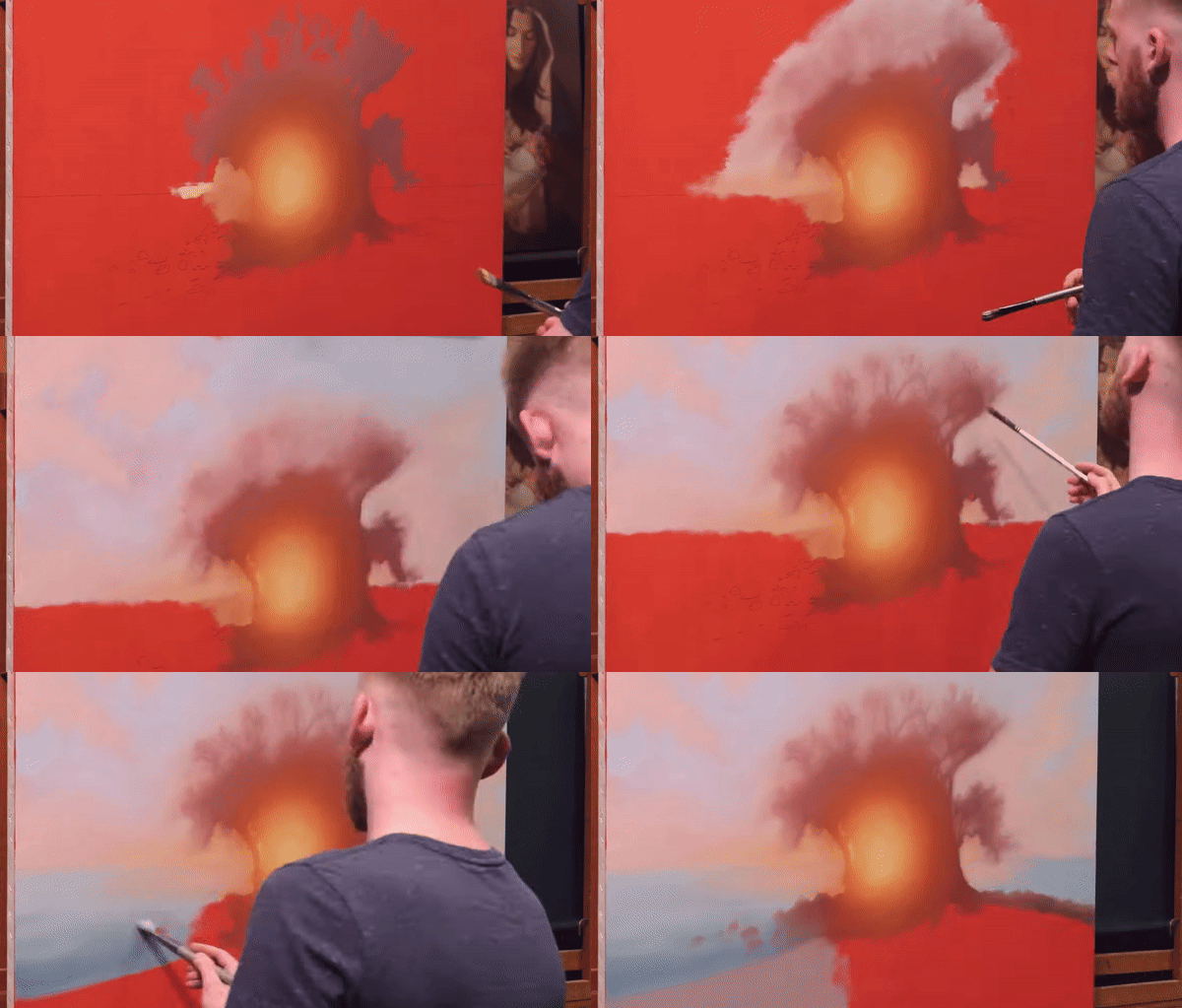
Here, Daniel is scrubbing in the colors of the sky, keeping edges soft.
I wanted to capture the overall impression of the landscape, carefully assessing the relationships between my values and colors.
And that's my first pass.
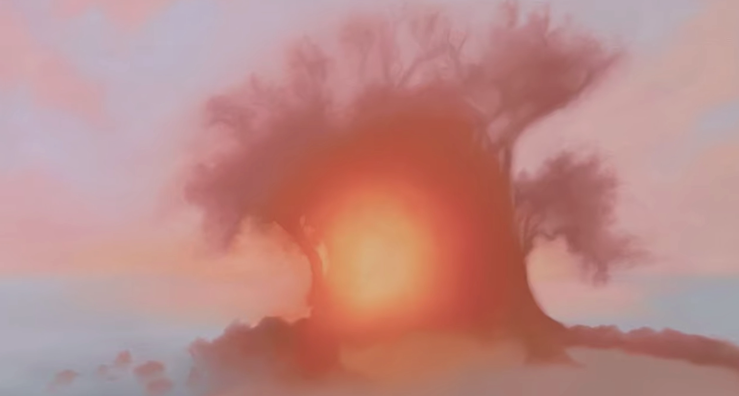
Daniel’s first pass shows the way he prioritised the light of the sun, an important mindset for any artists wanting to know how to make the sun glow in paintings.
The second pass - creating impressions of the landscape.
To create the impression of trees, I painted the sky around the trees. Again, I'm not painting the trees as objects. I'm using value, edge, and color to create the impression of trees.
You can see I’m compressing the gradient of the sky to create the shapes and outlines of the landscape.

Using the vacant shadows technique, you can see the shape of the trees emerging as Daniel paints the gradient of the sky.
This is a technique taught at Evolve called vacant shadows, where only areas touched by light are painted while the shadows are left alone.
The vacant shadows technique is a very efficient technique for making simple and elegant paintings, especially if you want to make art that appears realistic but doesn’t look like a photo.
Tip 4
The vacant shadows technique requires a neutrally toned dark canvas, and for the artist to have a solid grip on soft edges and control of the paint. It is an effective technique for how Daniel approached his painting and can be applied to yours if you approach yours in a similar way.
Then, I used a palette knife to scrape out some branches and twigs.
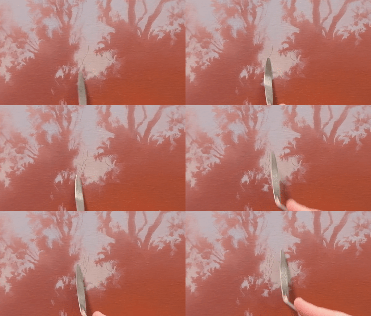
Creating the shape of the branches and twigs.
After I finished the trees, I began to paint the water.
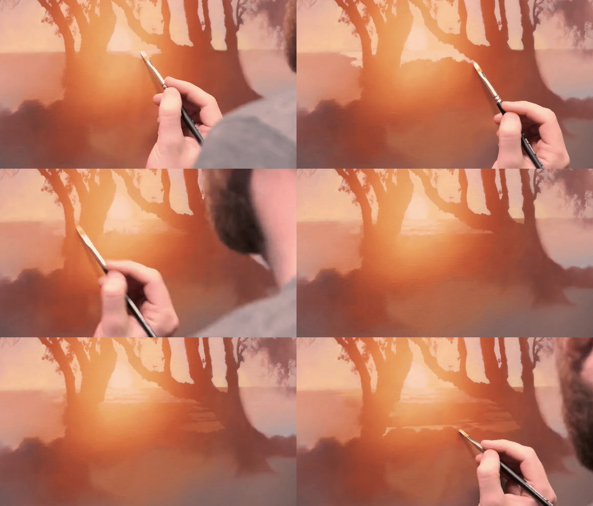
Daniel had to carefully consider how the light and shadow of the water impacted each gradient he needed to paint.
I had to be thoughtful about this section because the water is catching light and shadow as the sun is raking across it.
Tip 5
When learning how to make the sun glow in paintings, look carefully at how the light interacts with every element to ensure you’re capturing the sun’s glow
The light on the surface of the water needed a gradient and the shadows from the waves needed their own gradient.
This entire painting is basically gradients intermingling with each other in different shapes to look like one cohesive glow.
There’s a gradient in the shape of trees, there’s a gradient in the sky, and there’s two gradients for the water (one for the lights and one for the shadows).
I also wanted to capture some of the glare that you get when you look at the sun. So, I left lost edges in the areas where the waves connected to the trees creating that obscured effect in our vision.
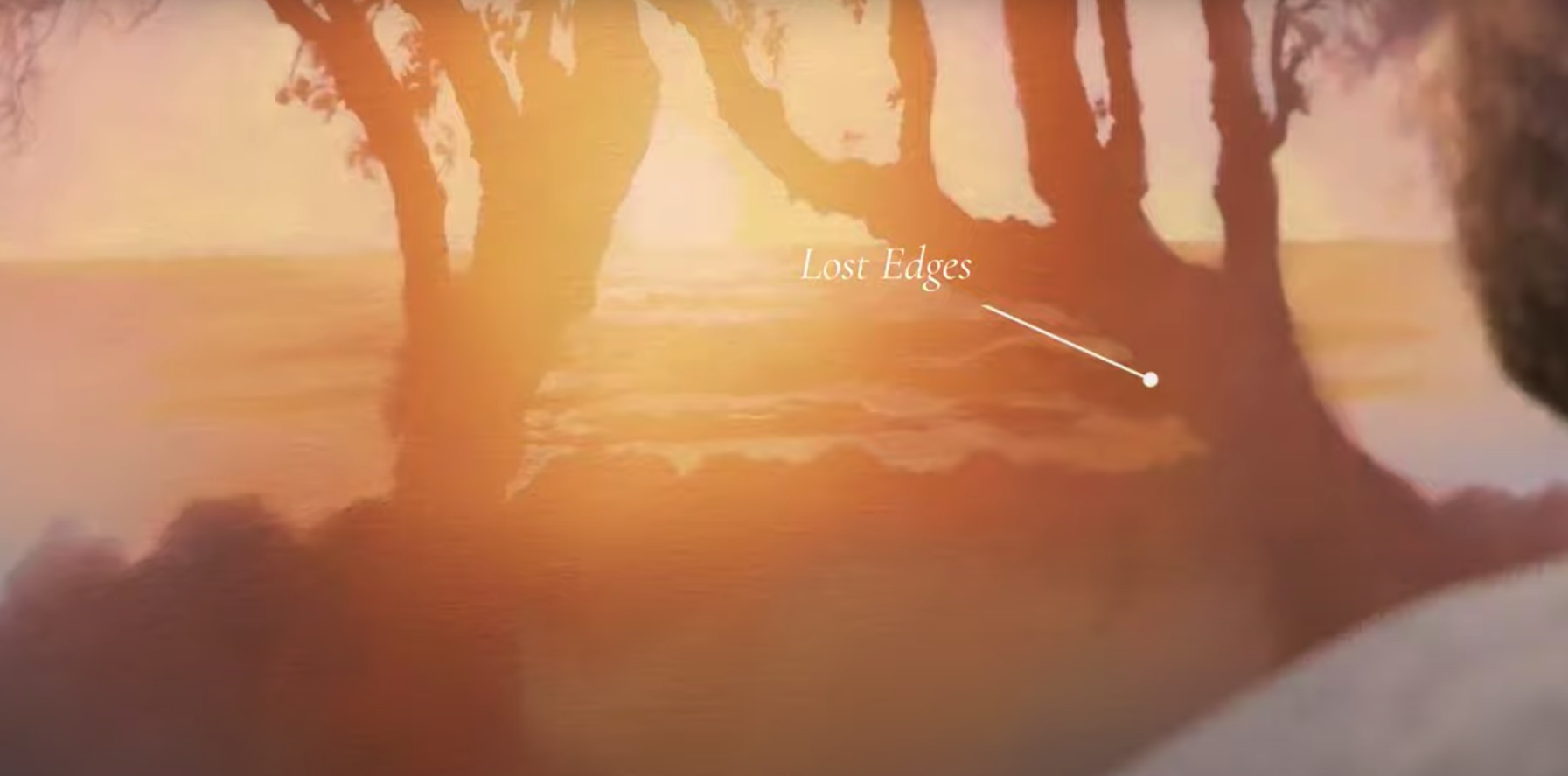
Here you can see the lost edges in the areas where the waves connected to the trees.
I intentionally kept the focus of the painting on the setting sun.
Adding in details of the rocks, and the bark of the trees would have taken away from the overall impact of the painting. I painted a few soft touches on the waves and the rocks, but nothing that would distract you from that moment when the sun catches your eye.
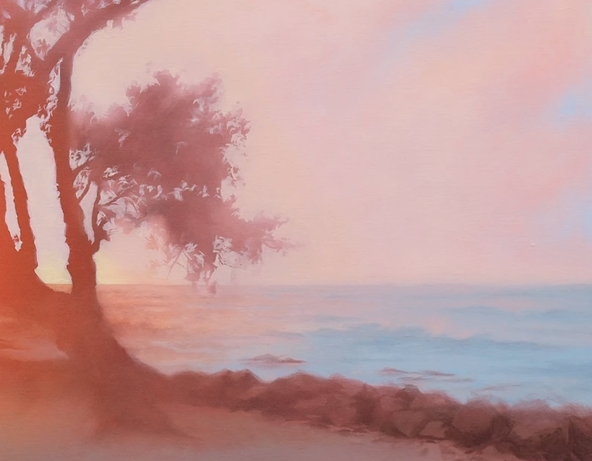
The soft details in the rocks and waves of the painting mean the focus of the painting remains the sunset.
Tip 6
Less is more - too much detail will take focus away from the glow of the sun.
And here’s the final painting.
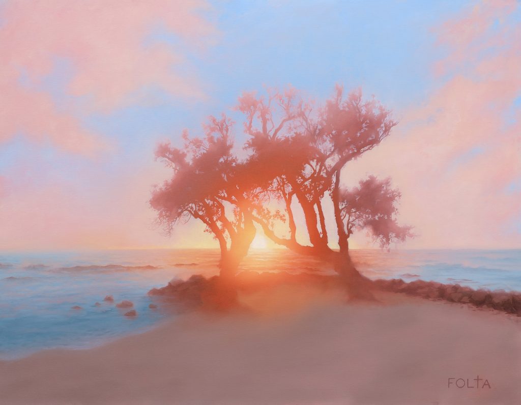
Yes Forever by Daniel Folta
How I approached the color palette.
Now that I’ve taken you through each pass, I can explain to you how I approached the color palette. This is important to consider for how to make the sun in glow in paintings.
I mapped out my color palette before I started painting with two criteria in mind.
First, the center of the glow had to be significantly brighter than anything else in the painting.
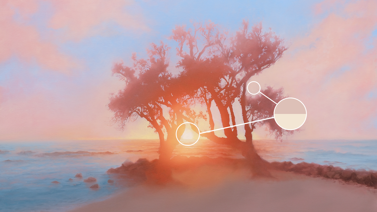
Daniel's color palette is focused on the sun's brightness and warmth.
The sun is a light source. Even if the clouds were white, they would still appear gray next to the sun. Otherwise, it won't feel like the sun is emanating any light.
Secondly, the glow had to be more colorfully vibrant than anything else. Everything else has to be gray in comparison.
If I put a bright red car in this painting, then the glow would appear dull, which we don't want. It would reduce the impact the sun is having on the environment.

The color palette has to prioritize the brightness and vibrancy of the sun. Anything brighter, like this red car, will make the sun appear dull.
Tip 7
Ensure your color palette prioritizes the brightness and vibrancy of the sun’s glow over everything else in the painting.
Bringing it all together
When painting, you use value, edge, and color to guide the eyes on the journey that you want them to take. In this painting, I'm driving people toward the center where the trees become one with each other in the light of the sun.
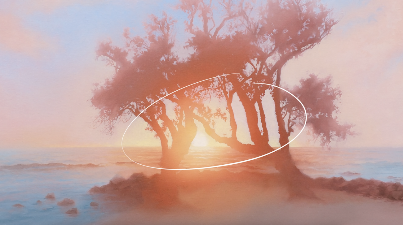
At the center of the painting, the values have the highest contrast , the edges are sharpest, and the colors are richest.
The fundamentals of values, color and edges are key to painting light, and I learned them from my art teacher, Kevin Murphy, who is the founder of the Evolve program.
If you want to understand more about these fundamentals CLICK HERE for a summary.
But if you really want to improve your skills then you've got to watch the free mini-course that Kevin made. It's a lesson on using values and edges to create form and depth in your art - CLICK HERE.
Until next time, happy painting!
